Friday, June 1, 2012

Dance Throughout Art

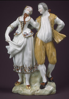
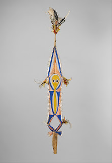
             The theme of my exhibit is dance and everything that correlates with dance. I have chosen a variety of artworks from different sections and artist from the Metropolitan Museum of Art. All of these artists from the different sections of the museum all relate in some weird way because of their connection with dance. All of the artworks that I have in my exhibit portray some form of dance; these dances varying from classical, spiritual, cultural, and so on. I expect the viewers of my exhibit to feel the sense of dance and it’s different forms of usage and emotions. 
             Dance is a type of art that can be used and interpret in many ways. It’s a form of releasing stress, a form of entertainment, of joy, sadness, and in some cases of pain. For me, dance is spiritual and also a way of escaping, when life gets a bit hectic. I escape through spiritual dance; I worship and give praise to my Lord and savior Jesus Christ. In doing this I am able to escape the craziness of life, even if its only for a few minutes. Dancing is a beautiful feeling, this is why I wanted my exhibit to represent dance and its different usage.  
             There are three artworks from my exhibit that really sum up what my collection is all about. These three artworks represent the different sections in which they came from; Asian Art, European Paintings, and European Sculpture and Decorative Art. These artworks not only share a similarly of dance but also of movement. The artworks were all made to look as if they were in motion. The first artwork in my exhibit is “Dancers, Pink and Green” by Edgar Degas; other then it being my favorite artwork out of the entire collection, it is a very beautiful painting. It reminds me of my friend Lesley, she was a dance instructor for teenagers. It was her first time ever conducting a play. She was short of staff so she asked for my assistance in helping with the costumes. 
             As I walked backstage, I saw a bunch of young girls running back and fourth getting accessories for their costumes. Other girls were waiting on the side line for their cue, and some fixing their hair and talking just like in Degas painting. The artist painted young girls putting on the finishing touches to their costumes to what seems to be a play. The other two artworks, “Shiva as Lord of Dance (Nataraja)” and “The Genius of the Dance” by Jean-Baptiste Carpeaux both have jumping movements as if hoping from one leg to another. I feel like one of the many meanings of these artworks is to catch the viewers attention by using body movements; which is why all of the artists have their artworks look as if in motion.  


Edgar Degas
“Dancers, Pink and Green” 
1890
European Paintings

Jean-Baptiste Carpeaux
“The Genius of the Dance”
1872
 European Sculpture and Decorative Arts

“Shiva as Lord of Dance (Nataraja)”
880-1279
Asian Art

Prince Paul Troubetzkoy
“Dancing Girl”
20th Century
European Sculpture and Decorative Arts

“Dancing Ganesha”
10th Century
Asian Art

Edgar Degas
“The Dance Class”
1874
European Paintings

Giovanni Domenico Tiepolo
“A Dance in the Country” 
1755
European Paintings

Edgar Degas
“The Dancing Class”
1870
European Paintings

Capodimonte
“Dancing Couple”
1755-59
European Sculpture and Decorative Arts

Edgar Degas
“Russian Dancer”
1899
European Paintings

Edgar Degas
“Dancer with a Fan”
1890-95
European Paintings

“Dance Wand (Bair)”
Late 19th -early 20th century
Arts of Africa, Oceania ant the Americas

Hubert Robert
“The Dance”
1733-1808
European Paintings

Pierre Monier
“Shepherds and Shepherdesses Dancing from a set of Mythological Subjects after Giulio Romano”
1639-1703
European Sculpture and Decorative Arts

Eadweard Muybridge
“Dancing Waltz”
1883-86
Photographs


Sunday, May 27, 2012

Chelsea Galleries Reaction

           If I were an art collector I would buy and invest on artworks that I really like and fine interesting. I would buy a piece that I know I would hang up around the house or a piece that I know would be very valuable in the future. Art collecting is not just about buying an artwork just to have it; even though some people do. Its about having a piece you truly like or fine interesting and have it displayed somewhere you or others can see it. The only down side about being an art collector is that all though the artist work may be fashionable now, it may not be at all fashionable ten years from now, this is why it’s best to buy an artwork you know you are going to actually like.
           For this reason I have chosen two exhibitions from the galleries in Chelsea, the art market place. I’ve chosen one artist and exhibition that I liked and one artist and exhibition that I disliked. I must say it was quiet difficult trying to find that one artists whose artwork I would collect. There were a couple of good exhibits but Ernesto Neto exhibits “Slow iis goood” at the Tanya Bonakdar Gallery took the cake. The pieces were so uniquely made; I could not keep my eyes off of his artworks. There were two pieces that really amazed me; the first one was “The Island Bird” and the second one was “The Sun Lits Life, Let the Son.”  What I liked the most about these two pieces was the way that the artist used different colored polyester rope. The artist medium was very unique and different from any other artwork that I have seen, for this reason I consider these pieces a good investment. Also these artworks are great pieces to have in your home as a lounge area, it defiantly has comfy seating. As for the exhibition that I disliked, Anish Kapoor’s exhibit “Concrete Coils” at the Barbara Gladstone Gallery did not catch my attention at all. I found the artist works to be plain and boring like its medium. The clay like material was formed into weird and unusual shapes that were not flattering at all. There was a piece that looked like a lot of unfinished ceramic projects all mixed together into one. I did not fine these pieces to be a good buy nor a good investment because these pieces are the type of artworks that a person should keep stored. They are just too dull and would not have me pleased, looking at them ten years from now. I would like an artwork that I would be able to display around my home and not inside a storage facility.
           In conclusion, being an art collector is knowing what is and isn’t  right to buy/invest in. Its about having a artwork you truly fine interesting and have it displayed somewhere you or others can see it. Even though it’s down side is that all though the artists work may be fashionable now, it may not be at all fashionable ten years from now. This is why it’s best to think thoroughly about what it is that you are going to be investing on and if it’s going to benefit you in the future.


Ernesto Neto 
“The Island Bird”
2012


Anish Kapoor
"Ga Gu Ma"
2012

Monday, May 21, 2012

Quiz Make Up

        The artist I choose was Judy Pfaff; she started off as a painter and kind of evolved into a sculptor. I am amazed at the sculptures and installation she has done; very beautiful work. Although Pfaff started off as a painter, I am more attracted to her sculptures. I like the hues and organic spaces of her sculptures and how “in your face” they are. Rather than her paintings, which are nice as well; but are just there hanging on a wall. A piece that I am kind of obsessed with is the "Buckets of Rain" sculpture. Though the piece is an emotional piece, I still fine it to be very beautiful. The theme of this piece and what she is communicating with the viewers is her inspiration from loss. Pfaff loss her mother and a couple of good friends and family members the year before she made “Bucket of Rain.” Her sadness inspired her to make a sculpture of darkness by using a large natural tree root and cutting that large tree root into two pieces. Then painting one root of white and the other of black and hanging the white root above the black root, representing happiness and sadness and the good verses bad. Pfaff piece really touched me because it brought me back to when my grandfather passed away a couple of years ago and the mixed emotions I felt when I was dealing with his loss.

Sunday, May 13, 2012

Mash Potato Delight

Mash Potato Delight is a delicious dish I invented one lazy afternoon. I had just gotten home from school and I had a ton of homework to do. I was so hungry but didn’t want to make something that would take hours to cook. I started looking inside the refrigerator and thought “hey! Potatoes! They’re quick and easy to make; plus with salami and vegetables, how delicious would that taste.” This dish has become a common meal to cook whenever I’m in a hurry or just want something quick to eat.
Ingredients:
1 to 2 Potatoes cut into four quarters
1 Roma Tomato cut in four slices
4 Cucumbers cut in four slices
10 baby carrots cut in half
4 Broccoli florets
5 Salami cut in four slices
1 Teaspoon of salt
1 to 2 spoonful of butter
2 to 3 spoonful of milk

Instructions:
1. Boil a pot of water, heat on high, add the 1 Teaspoon of salt and then add the chopped potatoes, until soften.
2. On a different burner boil another pot of water on high and add the baby carrots and broccoli florets.
3. In a small pot cook the sliced Salami and Tomatoes on medium heat.
4. When potatoes are soften, drain the water out and add the milk and butter into the pot. Then with a potato masher, mash the potato as you please; then place onto eating plate.
5. Drain the vegetables and place onto the side of eating plate.
6. Do the same with the salami and tomatoes.
7. Finish decorating your plate with the sliced cucumbers and now your ready to enjoy Mash Potato Delight!


Saturday, May 5, 2012

Sculpture Center Reaction

      Ever consider how an artwork effects the space it’s in. Or how the space itself can contribute to the artwork, well I haven’t until now. I recently visited the Sculpture Center to view “Bill Bollinger: The Retrospective”, looking at the physical space of the museum and how its way smaller compared to all of the previous museums I’ve visited; has made me come to the conclusion of installation and how it could either affect an artwork in a positive or negative form.
     One of the many artworks at the Bill Bollinger exhibit that caught my attention was the “Cyclone Fence,” the name says it all. Honestly, I think the artwork would catch any viewer’s attention because the artwork is almost in the center of the main floor exhibit. It’s a very interesting piece; the space and the architecture of the museum seem to work well with the artwork. If the same artwork were to be placed let’s say in the MoMa, it would not have the same “wow” factor as in the Sculpture Center. The plain white walls of the MoMa could not compare to the brick walls and warehouse design that makes the artist piece standout. 
     A second artwork that caught my eye was “Waterpipe,” I really enjoyed looking at this piece. The artwork was made out of plastic hoses and iron and placed into a tube. The artwork was installed with a white wall as its background. The installation of the artwork was thoughtfully placed; once again the artwork and the architecture complimented one another. I must say I was a bit deceived when I stepped inside the Sculpture Center, I honestly thought I was going to fine a room filled with plain white walls and the artworks and that’s it. I didn’t except to fine sculpture in the middle of the exhibit and thoughtfully placed artwork. 
     The third artwork that caught my attention is my favorite. This artwork is so simple, its two wheelbarrows filled with water. Although the artwork looked as if it belonged in a farm rather than a museum, I still loved the rawness of the work. If this artwork were to be placed in a different museum, it would still have the same affect that it has in the Sculpture Center. One of the many reasons that I favor this particular artwork so much is because it reminded me of when I was younger. I would travel to Dominican Republic for vacation and visit my uncles and help them with their farm. My job would always be to hold the wheelbarrow while my cousin threw dirt inside of it.
     Lastly, the space in which an artwork is placed in plays a great role on the artwork itself. I never actually took the time to appreciate installation and how it can affect an artwork. “Bill Bollinger: The Retrospective” exhibit at the Sculpture Center really changed the way I perceived art and the space it occupies. I now see how major installation is to an artwork, it could either affect an artwork in a positive way or if not carefully thought out in a negative way. Luckily for this exhibit it affected the artworks in a positive way. 


Bill Bollinger
"Cyclone Fence"
1968

Bill Bollinger
"Waterpipe"
1970

Bill Bollinger
"Untitled"
1970


Friday, April 27, 2012

Design in Our Lives


        This week my art class took its third field trip to the MoMa. This time my class viewed the 3rd floor architecture and design galleries. The class had the choice of picking four different works from the exhibit, two of the works being “high functionality” and the other two being “low functionality.” Having a chance to look at these exhibits really opened my eyes. Only because something is simply made and looks functional does not always mean that it actually is and vice versa.
        The first work that I chose was from Kazuo Kawasaki, this artist created a wheelchair that felt as good as it looked. Kawasaki created a seemly functional wheelchair made out of aluminum honeycomb-core wheels and rubber seat and tires. The artist made this creation after being involved in an accident that resulted in him becoming disabled. He wanted to create something that was comfortable and useful not only for him but for everyone. Another work what I found useful was the “Sea Shelter” by Nikhil Garde. This work of design is a great working raft that I would personality find very useful if I would ever need a water raft. It is properly balanced to one’s weight when boarding. It also has handles on both sides of the raft, with a step that extends under the water to make it easier for one to climb in. For these reasons I consider both of the artist works to be highly functionality. Both artists share a common similarity; they both have a unique style to their work. Kawasaki uniqueness is his medium and Garde uniqueness is the exotic shape of his water raft. This is why I consider both works to be useful and very successful if used in the real world.
        For the “low functionality” works, I chose Bruno Munari “Fork” and the MoMa store “Newspaper Coasters.” Munari’s work is a series of three disfigured forks; if actually used by someone it would be impossible to eat with. The tips of these forks are bended in such a bizarre matter that if someone tried to eat with it, they would probably end up hurting themselves. As for the “Newspaper Coasters,” I find them to be completely useless; cup coasters are usually made out of rubber, glass, or wood, not newspapers. These coasters totally defeat the purpose of having coasters because they are suppose to be used to protect the surface underneath and a newspaper is not going to get the job done. If a hot cup is placed on top of the coaster, the heat coming from the cup will shrivel up the newspaper. Or if a wet cup is placed on top of one of the newspaper coasters the water from the cup will just stink through and wet whatever surface the cup is on. Both of these artists commonly transformed something that is useful in the real world, into a not so useful design. If someone were to bend Munari’s piece into a straighter line or have made “Newspaper Coasters” out of a different material, then it would be considered more useful and ergonomic. 
        Lastly, in looking at these designs I have gotten a new perspective. It showed me that not all works have to be highly functional to be considered a good design. I found the “Newspaper Coasters” to be a good design just not a useful one; the same with Munari’s piece. Art and design I feel are one in the same. They are not different at all because a design is a form of art. We need to have some type of design in order to call something art. Whether it’s a straight line or a weird shaped piece of metal, it is art and a design.

Kazuo Kawaski
"Carna Folding Wheelchair"
titanium, rubber, and aluminum honey comb
1989

Nikhil Garde
"Sea Shelter"
nylon and rubber
2004

Bruno Munari
"Fork"
metal, each: 8 1/2 (21.6cm)
1958-1964

MoMa Store
"Newspaper Coasters"
Turkish newspaper, 100.3"5 diam.
2007


Tuesday, April 10, 2012

Illustrate a Story


The story I chose is "How did you meet Dad?" I found this story so cute, defiantly a knight in shining armor. My digital collage focuses on the beginning of the story where Florence, the mother, tells her story of how her late husband, Joe, saved her from a big guy. The collage is broken down into two parts, one side representing the party/get together for Joe and the other side representing the bathroom part of the story. And in the center of the collage I placed a heart between both sides symbolizing their love and marriage. 

Sunday, April 1, 2012

MoMA PS1: The Good, the Bad, and the Misunderstood

               Happy, sad, and confused are just a few of the emotions I felt during my class second field trip at MoMa PS1 in Long Island City, N.Y. My professor asked of the class to pick three works of art to write about, one work of art that we liked, one that we disliked, and one that we did not understand. As my classmates and I walked around the museum and looked at the different artworks, I found myself getting a little overwhelmed by the randomness of the museum. I remember looking at a good artwork with an interesting story. Then looking at the artwork next to it and being puzzled by the piece. I was so bewildered by the piece that I actually should in front of the artwork gazing at it trying to make sense of it. I then moved on to a different exhibit were as soon as I stepped in the room I was overcome by sorrow. I was so overwhelmed by everything; it was such an emotional roller coaster.
      One of the few artworks that I actually liked from MoMa PS1 was “The Three Disappearance of Soad Hosni” by Rania Stephan. This piece was about Soad Hosni, a famous Egyptian actress and her journey growing up in film. The artist showed clips of Soad Hosni early years as an actress all the way up to her last film, also including clips of raw documentary. One of the reasons why I liked this piece so much was because the artist was able to sum up pieces of the actress life and career and transform it into a lovely work of art. The piece also caught my attention because of the era of the films. As a teenager my sister was a really big fan of Marilyn Monroe. She would stay up almost till 2 or 3 o’clock in the morning watching Marilyn Monroe movies on AMC. I remember one night actually staying up with her to watch one of Monroe’s movies and I must say it was pretty good. After that night I started to take an interest in not just Marilyn Monroe movies but in movies filmed in the 1950s-1960s era. I loved the humor of the films and how some of the actresses had take charges attitudes. Stephan’s piece brought back good and fun memories of my sister and I spending time together, watching classic vintage movies.
      Another work of art that I saw that but kind of threw me off was Janet Cardiff “The Forty Part Motet.” While at the museum I didn't fully read the description about the artwork. The sound of the forty speakers were so loud and distracting, all I wanted to do was get out of the room. The music at first entering the room was soothing, so I thought. The longer I stood in the room the sadder I began to feel. It was as if a wave of sadness crushed over me, I kept thinking to myself, “what is this, I don’t even know what the music is saying and I’m feeling like this.” I was defiantly confused and did not understand what was going on. I guess the sound of a choir individually being recorded and put on speakers, is not a sound that my ears were quite fond of.
      Frances Stark “My Best Thing” is a piece that I had very little interest in. For starters, the piece was an “animated soap opera, constructed from interactions with online video chat rooms.” The description itself turns me off. As I stepped inside the exhibit room and watched a couple of minutes of the video. I kept thinking to myself, “what? What’s the whole point of this video.” Honestly speaking, I did not watch the entire video; I was surprised that I even stood in the room as long as I did because I really can’t stand anything animated. Don’t get me wrong, I could appreciate something even if it’s not my cup of tea but Stark’s piece was just combined with too many things that are not to my liking; animation, soap operas, online chat rooms, really?
      To conclude, my experience at MoMa PS1 will considerably be memorable. I went into the museum happy and excited to learn about the artworks but left confused and a bit frustrated. Yes, I know it may sound like I’m over exaggerating but I’m not, okay maybe just a little. But like I said before, it was an emotional roller coaster. Even though my MoMa PS1 experience was not the best, I would still encourage others to go and visit the museum. Only because I did not really enjoy the museum does not mean that someone else is not going to either.


Rania Stephan
"The Three Disappearance of Soad Hosni"
Digital video, color, 70 min.
2011


Janet Cardiff
"The Forty Part Motet"
40-track sound recording (14:00 min.)
2001

Frances Stark
"My Best Thing"
Images, slideshow (video, color, sound)
2011


Tuesday, March 27, 2012

MoMa PS1: Surasi Kusolwong Exhibition

        Yesterday, my art class took a field trip to MoMa PS1 in Long Island City. I most say, this Museum was one of the strangest Museums I've ever went to. Here are a few pictures with me and my classmates, Chris and Imani, on top of "Golden Ghost (The Future Belongs To Ghosts)" by Surasi Kusolwong. It was a pretty cool piece, we are sitting on top of industrial thread and it's spread around all over the room. In this exhibition we are suppose to search for gold necklaces that are hidden within the cotton. As you all may see we just sat there, we didn't even know we had to fine GOLD lOl. It was a pretty cool time and I look forward to going back to the "Golden Ghost" exhibit and actually look for those gold necklaces hahaha!!


Saturday, March 24, 2012

Art and Identity: The Museum of Modern Art

        Art making is a personal endeavor that communicates the experiences of the artist. The best kind of art has the ability to surpass an artist’s individual experience, and communicate to the experiences of a broader audience. An artwork can relate to the identity of an individual, it can relate to a specific cultural identity, and it most definitely relates to the identity of the time during which it was created. “Cindy Sherman” and “Contemporary Galleries: 1980-Now” are two exhibitions that expressed these different types of identity.
        During my class first filed trip to the Museum of Modern Art, we viewed a couple of artworks from “Cindy Sherman” and “Contemporary Galleries: 1980-Now” exhibitions. I found the “Contemporary Galleries: 1980-Now” much more interesting. Martin Kippenberger’s “Untitled” from the Series Dear Painter, Paint Me; is an artwork that embodied individual identity. It shows the artist sitting down on a sofa on a down town street corner in 1979, when he visited New York City. Another artwork that represents personal identity is Felix Gonzalez-Torres, “Untitled”, a black and white photograph of the artist empty bed. Being that Torres artwork mainly deals with something about AIDS or educating yourself about the disease. I feel like he is showing the audience his sadness about losing his partner to AIDS. The photograph shows an empty bed with the imprint of two bodies. The two imprints representing Torres and his partner and the emptiness of the bed as a symbol of his partner’s death. 
        Mariko Mori “Star Doll” is another example of how identity is expressed through art. When I looked at her piece I automatically thought “this has to be a Japanese artist”; the piece is of herself as a computer-fabricated pop star. The dolls outfit looked like that of Japanese pop culture/fashion. As a fashion lover, I like to explore the world of fashion and see what people from different cultures wear and their styles. One of those cultures being Japanese pop culture; their style is very unique and colorful, just like Mori “Star Doll” piece. As I read a little about the artist I was not surprised to read that she’s from Japan and a former fashion designer, among other things. Also Claude Closky “Beautiful Face” is an example of culture identity. This artwork being directed towards the female gender; Closky artwork looks to be a Christian Dior makeup AD with two images of eye shadow overlapping the bigger images in the background. 
        Another identity that is seen through art is the historical identity. “Exodus of Confederates from Atlanta” by Kara Walker, is a print that illustrates slavery during the Civil War. The artwork is a reproduced illustration from Harper Pictorial History of the Civil War and layered with a caricatured silhouette of African Americans. Representing a historical time where African Americans were kept as slaves and were withheld freedom. Walker also uses positive and negative space - a silhouette within a silhouette – to bring attention to the “African American boy who is loading a caravan of white civilians ordered to evacuate following Confederate Army losses in Atlanta.”
        In conclusion, creating art is a personal endeavor that communicates the experiences of an artist. “Cindy Sherman” and “Contemporary Galleries: 1980-Now” exhibitions expressed ways of communication seen through individual, cultural, and historical identity. It excites me to see how artwork can vary, showing not only that all artworks are just about portraits, people, and buildings. But also how art can demonstrate and teach the audience things that they did not know of as well as look at good art.


"Contemporary Galleries: 1980-Now"

Martin Kippenberger
"Untitled"
Synthetic paint on canvas
1981

Mariko Mori
"Star Doll"
Marmitte, Tokyo
1998

"Cindy Sherman"

Felix Gonzalez-Torres
"Untitled"
Billboard
1991

Claude Closky
"Beautiful Face"
Page project for the exhibition global positions in the newspaper Der standard
2000

Kara Walker
"Exodus of Confederates from Atlanta"
Lithograph and screenprints
2005


Thursday, March 15, 2012

Narrative Digital Collage


        This digital collage is about one of my favorite dancer/choreographer, Danielle Polanco. I made her to be the star of a "hit" Broadway play called "Dancing On Broadway." "Dancing On Broadway" has been sold out for months. And this very day just so happen to be Danielle's last run on the play. All of the people in the audience cheered, applauded, and took photos as Danielle danced her last number.

Tuesday, March 13, 2012

Carol's Art Adventures

        This blog is a school based blog about guess what, ART. I attend LaGuardia Community College in NYC and this is the first time I've ever had to do a blog for a class, so I'm really excited. This blog will consist of my art projects, group projects, pictures of different types of artworks, my thoughts and opinions about art, and all things pertaining art...enjoy!

Good Art Bad Art

Good Art.

        My opinion of good art is an art work that catches the viewers attention and/or causes a reaction/emotion out of the viewer. Whether the reaction be good or bad. For example, I really like Abstract Art, it's so different and unique, most of the time I have no idea what the artworks are about. But I still enjoy them because that type of artwork always causes a reaction out of me, even if the reaction most of the time is "what the heck!?"


Bad Art
        
        My consideration of bad art is what good art isn't, which is meaningless. Bad art is a meaningless artwork, an artwork that does not stir up any emotions, feelings, or reactions. A work of art that is just for show and that has no story or meaning behind it. Like, combining a couple of pieces of metal together into a bizarre shape. I never really understood it, whats the meaning behind it, what caused you to put something so unusual together and have the nerve to call it art.